Time-saving CSS techniques to create responsive images
Adrien Zaganelli -

As a web developer, there is a high probability that you have encountered the two enemies of this article: images and deadlines. Sometimes, for some reasons, your images won’t fit the layout and you don’t want to wrap your head around this for hours.
This situation has happened to me many times and I have learned from my mistakes. No more black magic hacks — here are my five favorites techniques to handle image resizing.
the “OMG I NEED THIS ASAP” way
It’s 5:00 pm on Friday, you have to finish this page, but the images won’t fit the layout. It’s time to use your magic trick!
Sounds familiar? We’ve all done it once, doesn’t it feel like cheating to you?
Using background properties is very useful, they just work. Yet, remember that you should use them only for non-content images or as a replacement of text and in some particular cases.
The way from the future
What if I told you this kind of magic exists also for <img> elements? Say “hi” to the object-fit property — which also works for videos, by the way!
That’s all folks! See how when we retrieve the friendly value cover, we can also use contain.
Okay what’s the trap?
Unfortunately object-fit will not work on IE and older versions of Safari, but there is a polyfill.

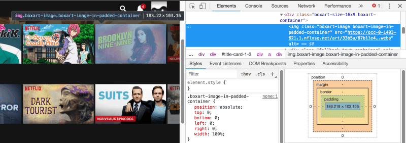
The “Netflix” way
You may think “nice trick man, one more way that doesn’t work in old browsers like IE ?”. Don’t worry, this one works everywhere and it is my favorite! You’ll need to wrap your image with a relative padded parent.
We will keep the image ratio with a percentage on the padding property. Your image will be a full size absolute child.
The code looks like this:

A little demo:
The Simple way
You may already know this one:
If your layout isn’t too complicated, it works in most cases.
The Performance way (Advanced)
By performance, I mean load times. A big hero image can ruin it and make your page feel slow, especially on mobile.
Did you know that in modern browsers you can change an image source depending on your page width? That’s what srcset is made for!
You can combine them with the HTML 5 <picture> tag, which gracefully degrades with an <img>.
To Recap
- Use
background-imageif your image is not part of the page’s content. - Use
object-fitif you don’t care about IE. - The padded container technique, used by Netflix, works everywhere.
- In most cases, just add
height: auto;in your CSS. - If you need fast load times, use
srcsetto load smaller images on mobile.